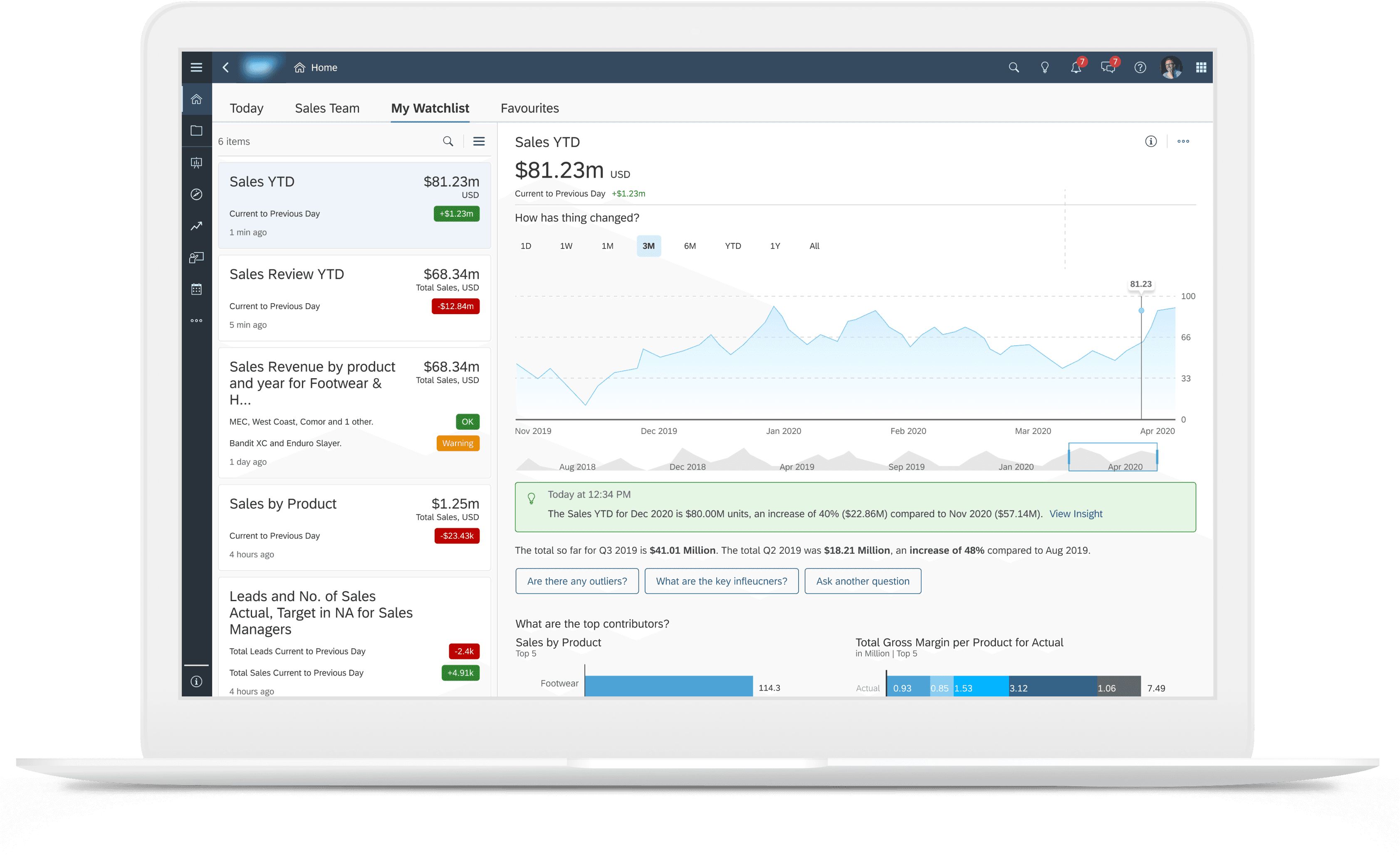
Monitoring Your Most Important Data

My Role
UX/UI Designer
UX Researcher
Team
Myself &
1 x Design Manager
1 x Product Manager
1 x Product Expert
Skills
UX/UI Design
Mobile Design
Responsive Prototyping
Cross team collaboration
Business Impact
• Improved low NPS score from poor usability by reducing 4 click workflow to 1 click.
• Supported division strategy of empowering business users (less technical).
Timeline
Dec 2019 - April 2020 (4 mos)
The Design Process
Background
SAP Analytics Cloud is SAP's flagship business intelligence platform. At the time, it had a low NPS score due to poor usability. A key business goal was to improve this and support less technical users with their common user flows.
The Problem
Business users are typically interested in very specific company KPIs. Currently, they need to navigate through multiple files, pages, and charts to view these data points they monitor regularly.

Click 1
Access File Browser
Click 2
Open File
Click 3
Navigate Pages
Click 4
Locate data point + refine
The Goal
Create one place for users to assemble, monitor, and understand their most important data points.

Our Approach
Leveraging customer insights and stakeholder interviews to inform a rapid iteration cycle and MVP development.

Customer Insights
We needed to better understand the user needs and pain points when monitoring their data so we looked through feedback gathered from product analytics, community forums, and NPS score reports.

Stakeholder Interviews
We also needed more context around the user needs, technical constraints, and feature scope so we conducted 30 minute semi-structured interviews with relevant stakeholders.
Product Management
Why
Knowledgable about customer feedback, industry trends, and overall product strategy.
Goal
To better understand customer experience using SAC and how to align feature development with future of data analytics, and product positioning.
Key Takeaways
• Analytics is moving towards an ad hoc service and needs to prioritize non advanced users.
• SAC is needs to become more cloud native and move away from file based structures.
• Data point monitoring is primarily for executive suit users and requires a simple and intuitive user experience.
Design
Why
Knowledgable about UI standards, customer personas, and known pain points.
Goal
Better understand past design work done, known user pain points, and user personas.
Key Takeaways
• Some work had already been done to create a high level storyboard which could be used as a starting point.
Development
Why
Knowledgable about system architecture, technical constraints, and development costing.
Goal
Better understand system constraints, MVP development timelines, and investment cost.
Key Takeaways
• Project should take a mobile first development path with desktop to follow.
• Initial Beta release for mobile can inform next phase of development for both mobile and desktop.
Key Insights
Data from our research was synthesized and analyzed to generate 5 key insights informing the design direction.
Created by Yudhi Restu Pebriyanto
from the Noun Project
Business User Centric
The feature should be developed with the business user in mind. They are the least technical and therefore should be a seamless user experience.
Created by sumarni
from the Noun Project
Data Exploration + Insights
The feature should seamlessly integrate data exploration and smart insight features to allow for the exploration of data point fluctuations.
Mobile First
The feature will be developed for mobile first as it is the primary use case. After beta testing the feature will be refined and released for desktop.
Created by Reza Nur
from the Noun Project
Ubiquitous
Users should be able to add data points from all areas of SAP Analytics Cloud and all data visualizations.
No Files
The feature should not make use of files and should exist in a ubiquitous way throughout SAP Analytics Cloud.
Concept Ideation
Initial ideas were mocked up based on the research insights. A design review with product management and product experts was done to gather feedback.
Option 1

Option 2

Design Solution
Option 1 was chosen and expanded on due to better accommodation of a larger data point list, better use of screen space for data exploration, and better consistency between web and mobile.
App Wide Integration
Users can add data points from anywhere across the product to their watchlist. Creating a more consistent and unified experience.


Single Point of Entry
One click from the home page. Business users have a single place to view and monitor all their most important data points.

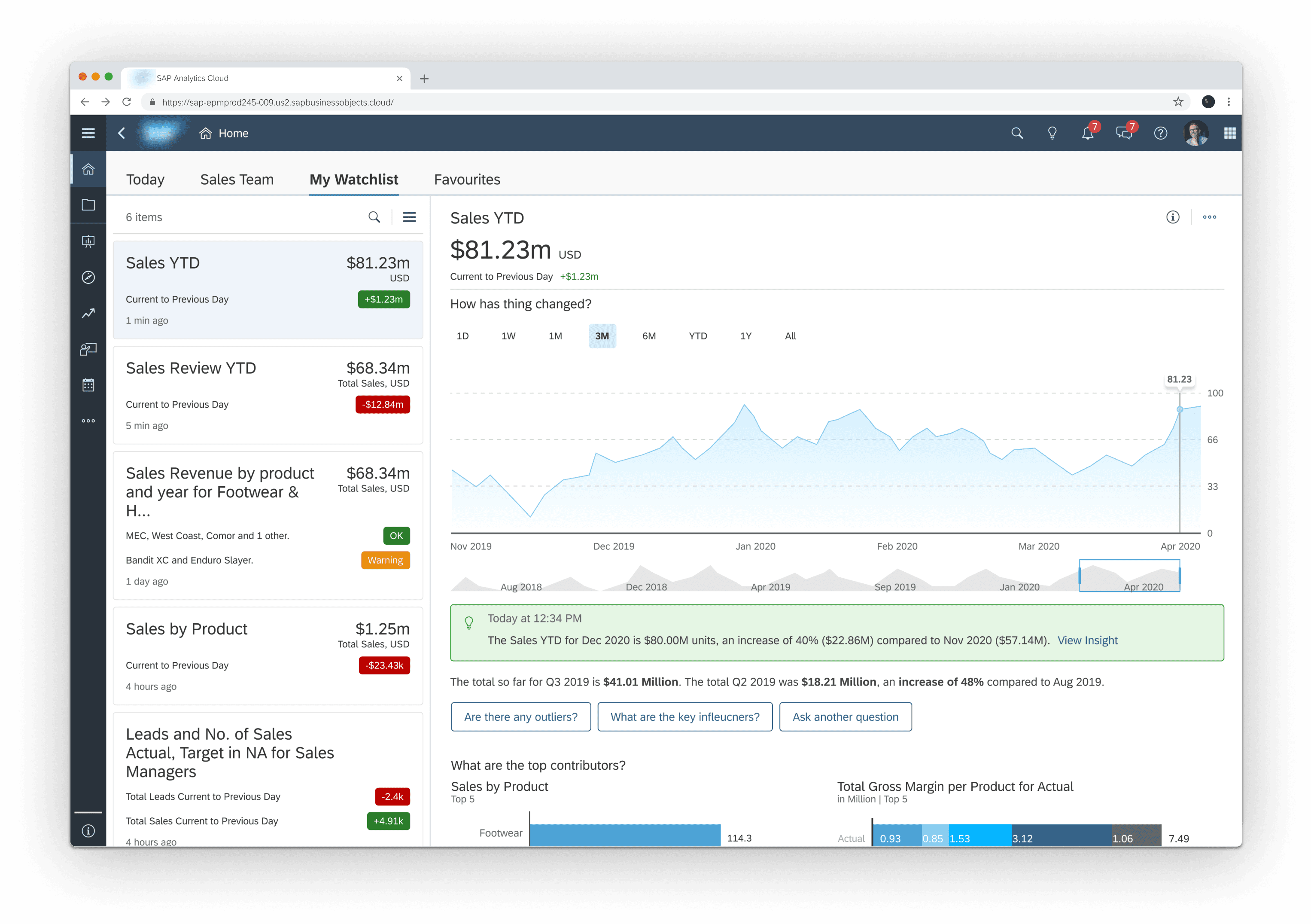
Contextual Exploration
Data exploration tools are available and AI powered insights provide contextual information to better understand key influencers of data point changes.


Impact
NPS Score
Improved low NPS score from poor usability by reducing 4 click workflow to 1 click.
Supporting Division Strategy
Supported division strategy of empowering business users (less technical).
Reflections
Development Support
The development support process went very well for this project. A key part of this was to establish a framework on JIRA to log design bugs that were uncovered in design reviews, a consistent bug logging structure, and establish bi-weekly design/development calls. This is something I carried forward and built upon in other projects.
Research Triangulation
Like any product, its vital to analyze customer feedback and usage analytics. However, no source of data is complete on its own. Combining three different sources of analytics with stakeholder interviews provided the necessary depth to understand the core use case and features that needed to be built into the watchlist.
Company North Star
SAP Analytics Cloud is a massive product with many teams simultaneously working on feature development guided by a product wide north star to become more cloud native. Earlier alignment and consideration of how this feature fits into the bigger product roadmap would have helped avoid unnecessary iteration cycles and easier senior management buy-in for investment.
Website design and content by Ori Nevares